With the recent Presidential Elections of 2000 and 2016, twice has a candidate won the popular vote and lost the Electoral College (EC). As a refresher, the rules of the electoral college are as follows:
- Each state is given 2 Electoral Votes (EVs) plus additional EVs depending on their population, with a minimum of 3 EVs
- Whoever wins the popular vote within each state is given every single EV (with the exceptions of Maine and Nebraska)
A common idea is that the EC provides protection to small states, stopping large ones from dominating the popular vote. I will be using 2016 election data and treemaps to present a visualization of state voting power using various metrics to examine this idea. Each state’s area will represent a metric, and its colour represents how it voted in 2016.
First, visualizing the popular vote. In this treemap, you can see the voting population by state:
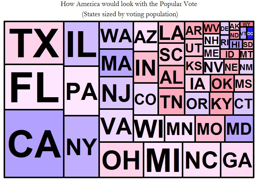
Right away you can notice that the USA’s voting population isn’t as concentrated in large states as one commonly hears. Here’s how one political cartoonist (very misleadingly) represents it:

How do you represent how the election looks with the EC in place? A common way of doing it is to represent the states as EVs granted per popular voting population. This is a highly misleading way of doing this, because a state’s EVs are winner take all (WTA).
One quick way to do this is to look at the EVs granted per popular vote margin for each state. This represents how worthwhile it is to get people in each state to vote for you – the closer the state, the easier it is to pick up all of those EVs, and the more EVs the better. This is one way to represent how America looks with the electoral college:
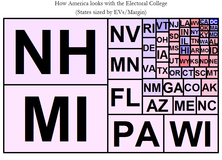
Right away this visualization shows you the disproportionate power afforded to large swing states in the electoral college. NH, MI, PA, and WI take up most of the image. All the small states are packed into the corner (as well as large ones). Right away you can see that the EC massively disenfranchises small states.
Another appropriate metric to use is the tipping point chance. Not all EVs are created equal, because the presidency is also winner-take-all. Someone gets 270 EVs and wins or they don’t. Hence the EVs that are closest to this 270 threshold are more valuable, and those far away are less valuable (EVs after 270 are wasted). To represent this, the states were ranked by popular vote margin fraction, and their cumulative EVs added up, finding the margin corresponding to 270 EVs. In 2016, the tipping point state was Wisconsin, with a margin of 0.7%. Hence you can get a rough idea of the relative tipping point chance by taking the difference between the margin of a given state and this tipping point margin, and taking the square root of the reciprocal. This makes states more important the closer they are to the tipping point margin (the attached R code will make this more clear). You can read more about tipping point states here: http://fivethirtyeight.com/features/will-the-electoral-college-doom-the-democrats-again/
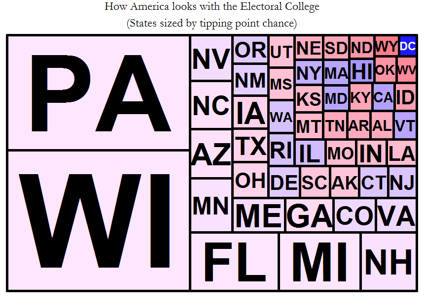
The same offenders pop up again, but show the increased roles of Pennsylvania and Wisconsin as opposed to New Hampshire in the previous visualization. This represents how if Trump had won NH he probably would have already won, and it didn’t do much for Clinton either – she needed PA and WI at least, and then even with the loss of MI she could have picked off FF or NC to make up the difference.
The best way then to demonstrate voter power is to combine these two metrics. The first one tells you the power of each voter in terms of how many EVs they are worth, and the second one tells you the power of each of these EVs.
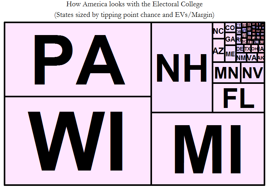
This tells the complete story and gives you an idea of how each candidate had a path to victory – in the end it came down to these 5 states. PA, WI, NH, FL, and MI.
The power of these visualizations is that it 1) debunks the common myth that the EC favours small states, 2) shows that the EC massively pumps up the power of a handful of large swing states, 3) demonstrates clearly how a candidate can win the popular vote and lose the EC, and 4) debunks the myth that a few large states would dominate a popular vote contest.
A good question would be can we test these metrics to see if they match up to reality? Yes. It is a matter of public record of how many visits each candidate made to these states, and how much campaign money they spent there (on ads, events, etc). If these metrics are a good measure of a state’s importance, they should be good predictors of visits and campaign spending. I’ll write this up after crunching some more data.
Want to play with my data and methodology? Stay tuned, after some cleanup I’ll post the R source code and a Google Spreadsheet of the data I used.


